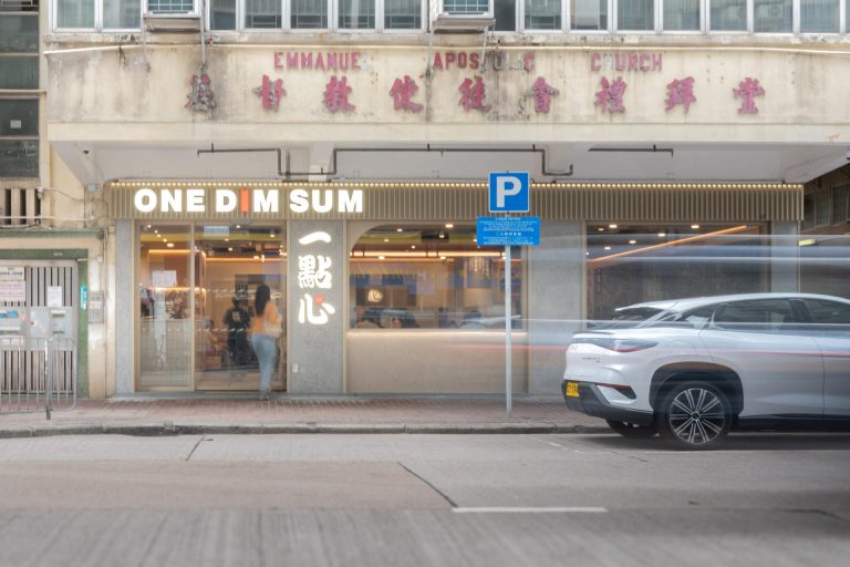
We are honored to collaborate with 7-Eleven Hong Kong on developing a New Concept Store, along with a comprehensive set of design guidelines for future rollouts across Hong Kong, South China, and Singapore.
This reimagined concept is more than just a convenience store; it’s a refreshing experience that embodies the spirit of modern retail, transforming it into a lifestyle brand that meets the daily needs of its customers. By blending community, sustainability, and excitement, we believe this design will set a new benchmark for the convenience retail industry. We look forward to seeing how this transformation elevates the 7-Eleven brand and enhances customer connection and interaction moving forward.
Key Design Features
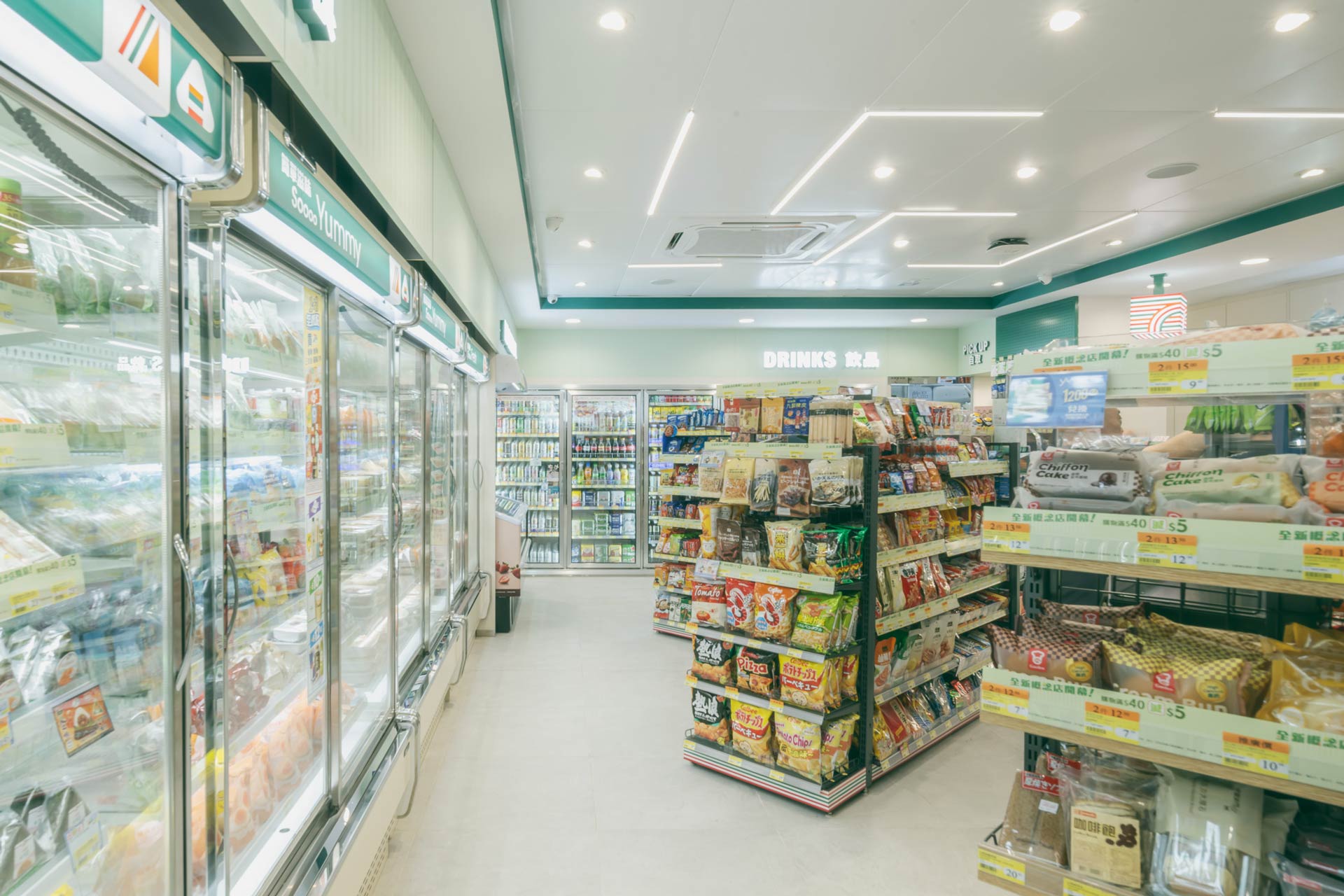
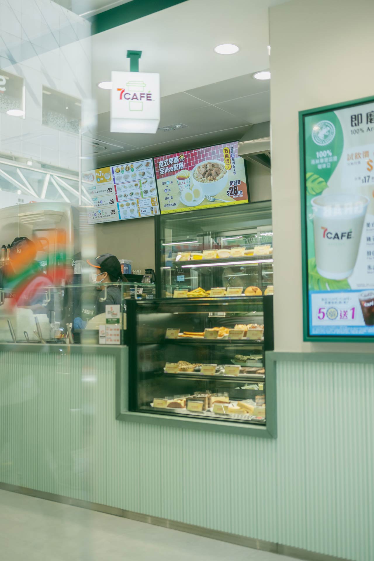
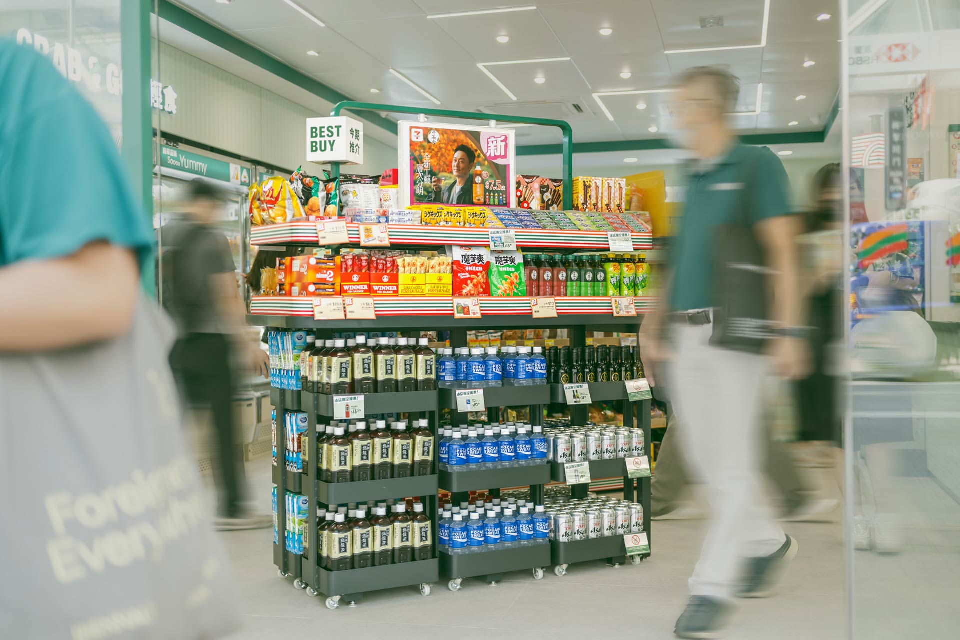
Enhanced Product Display
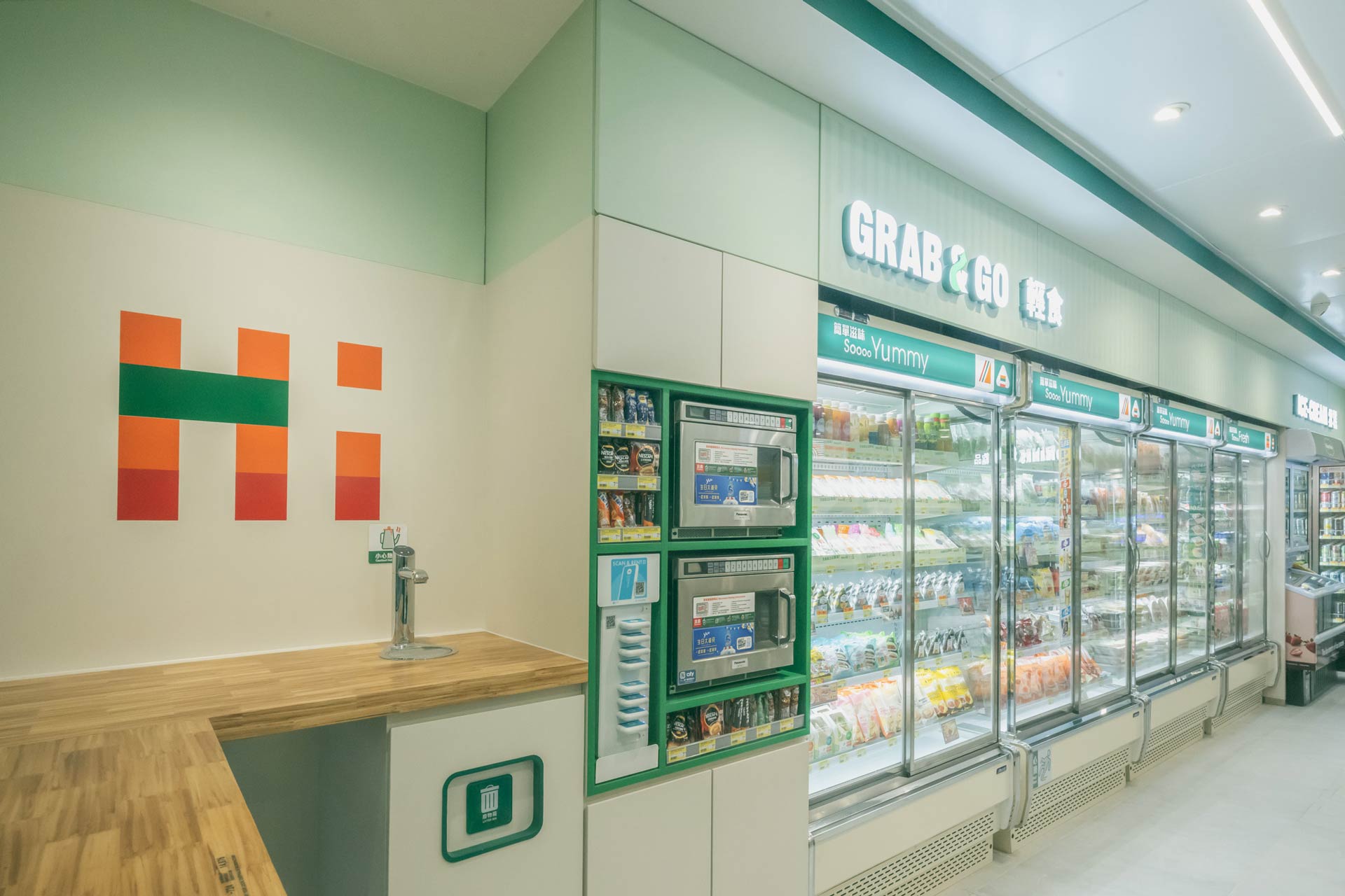
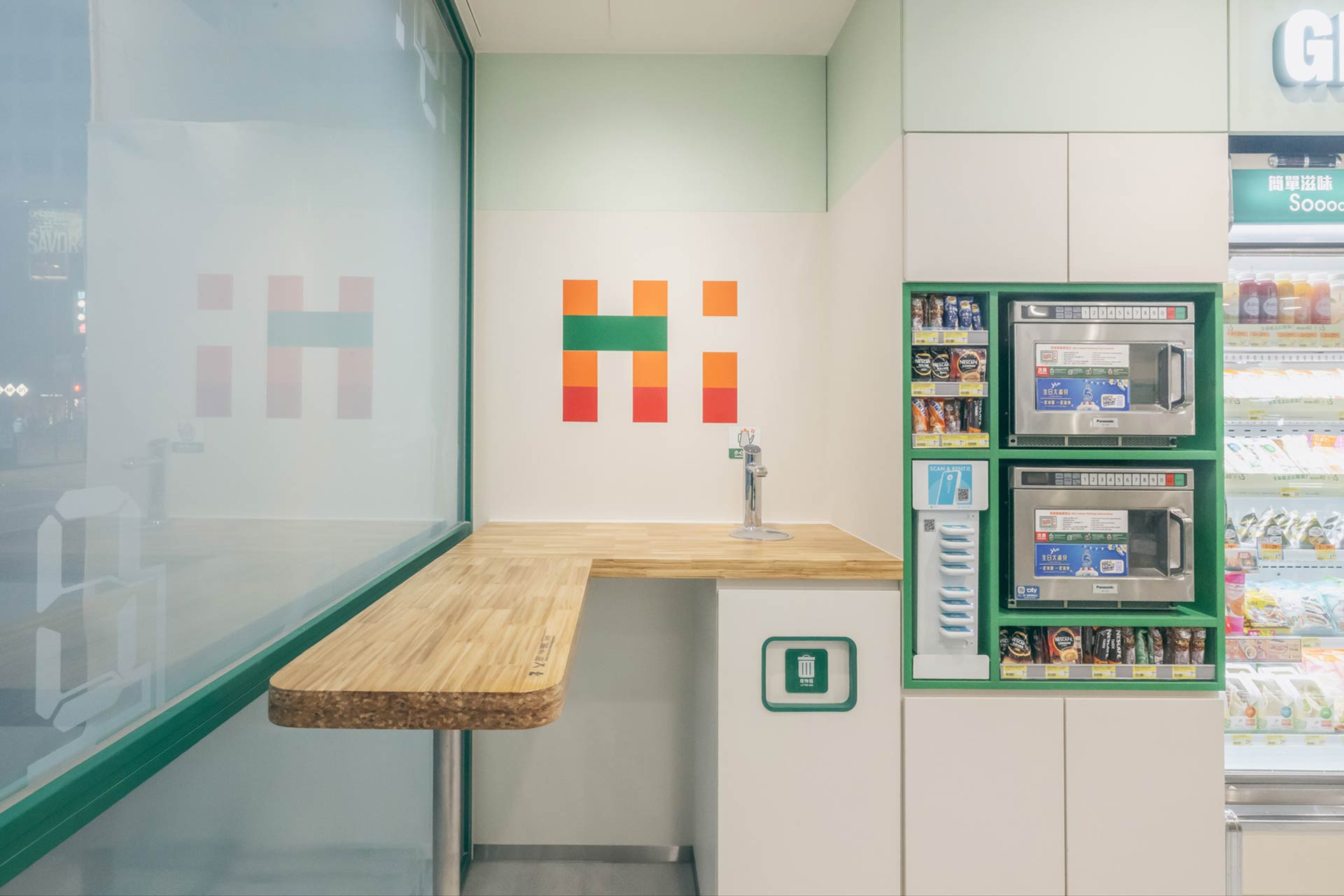
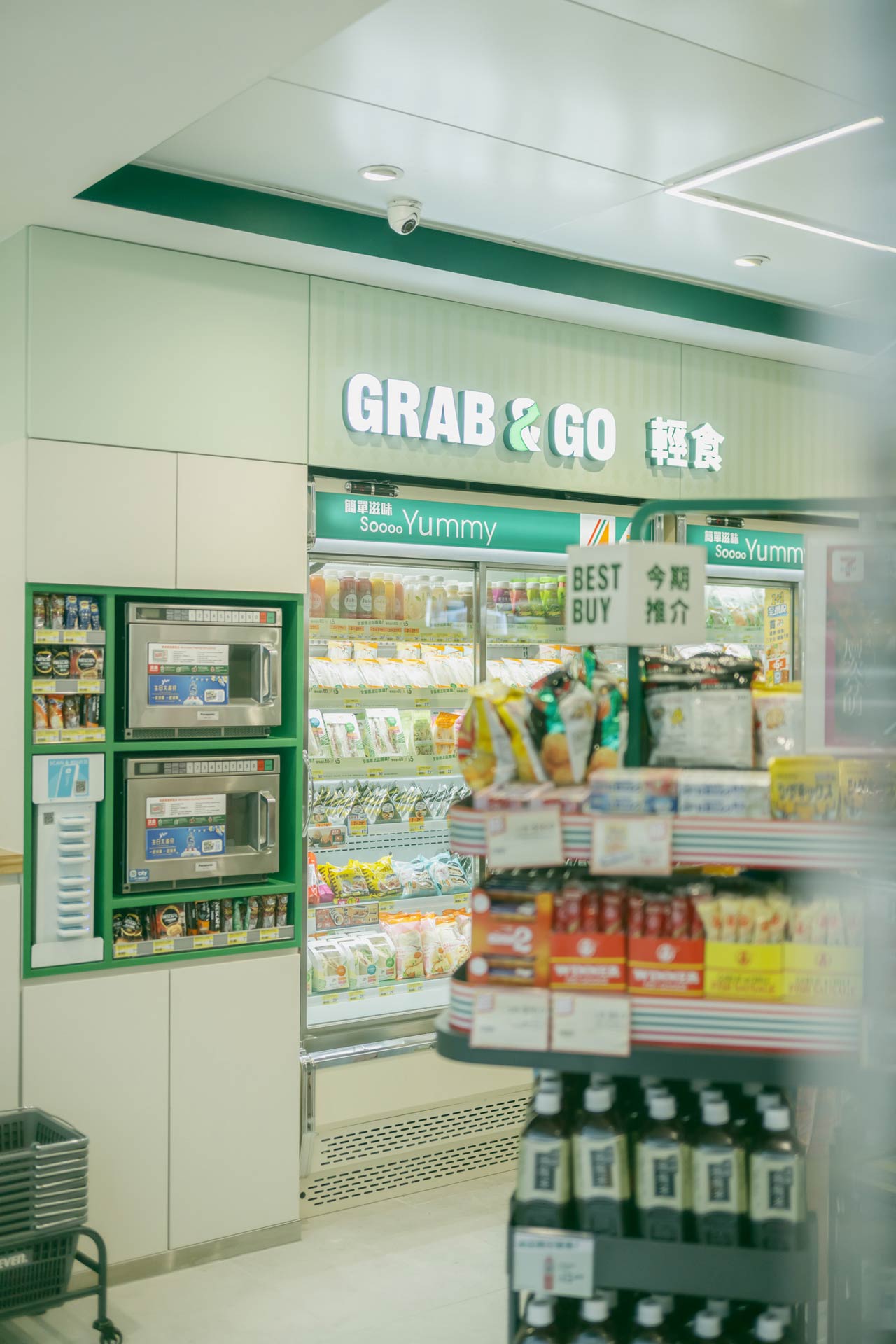
We redesigned key feature cabinets to improve product visibility and accessibility, ensuring that customers can easily find and explore their favorite items while discovering new ones.
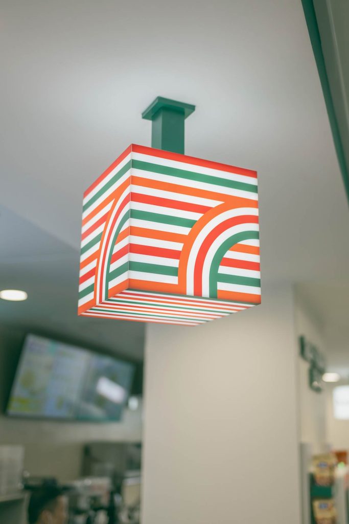
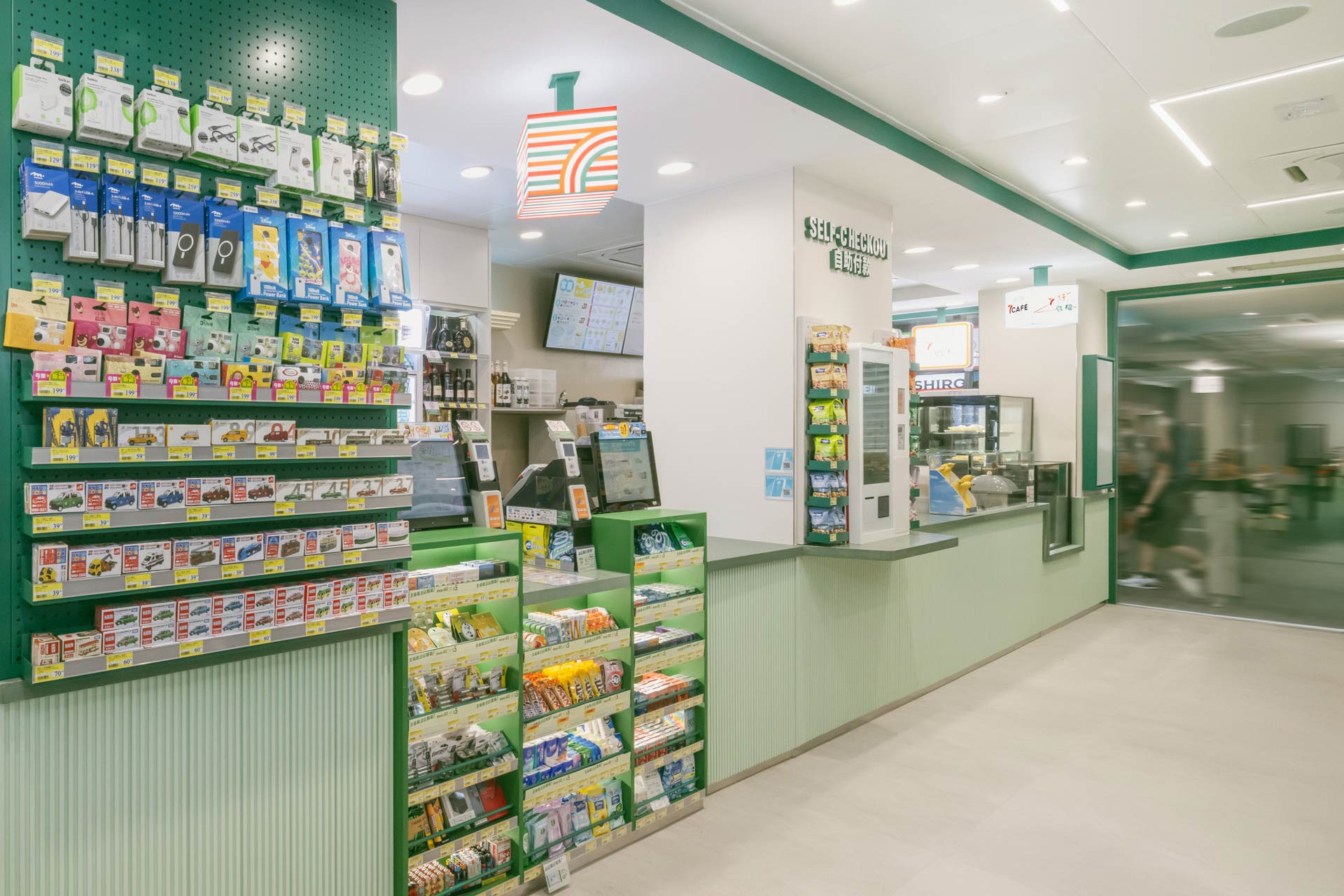
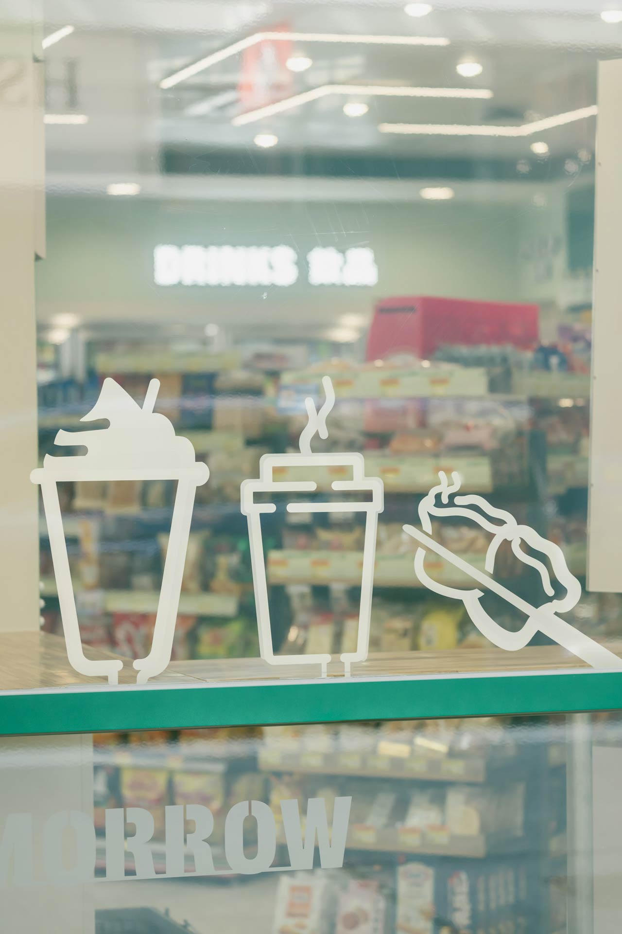
Cohesive Signage
Our team developed new signage that aligns with the overall look of the store, enhancing brand consistency and making navigation intuitive for customers.
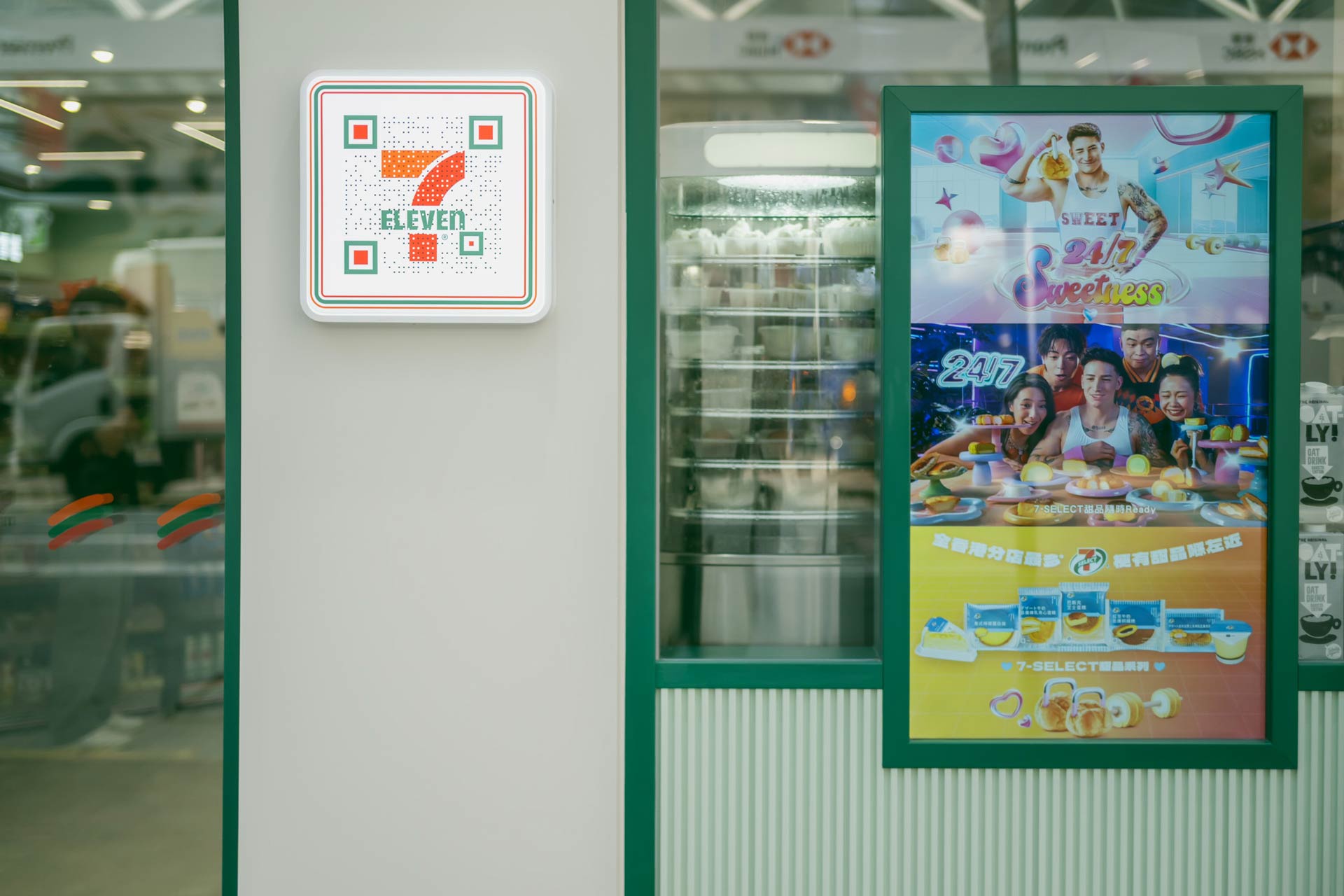
Digitalization
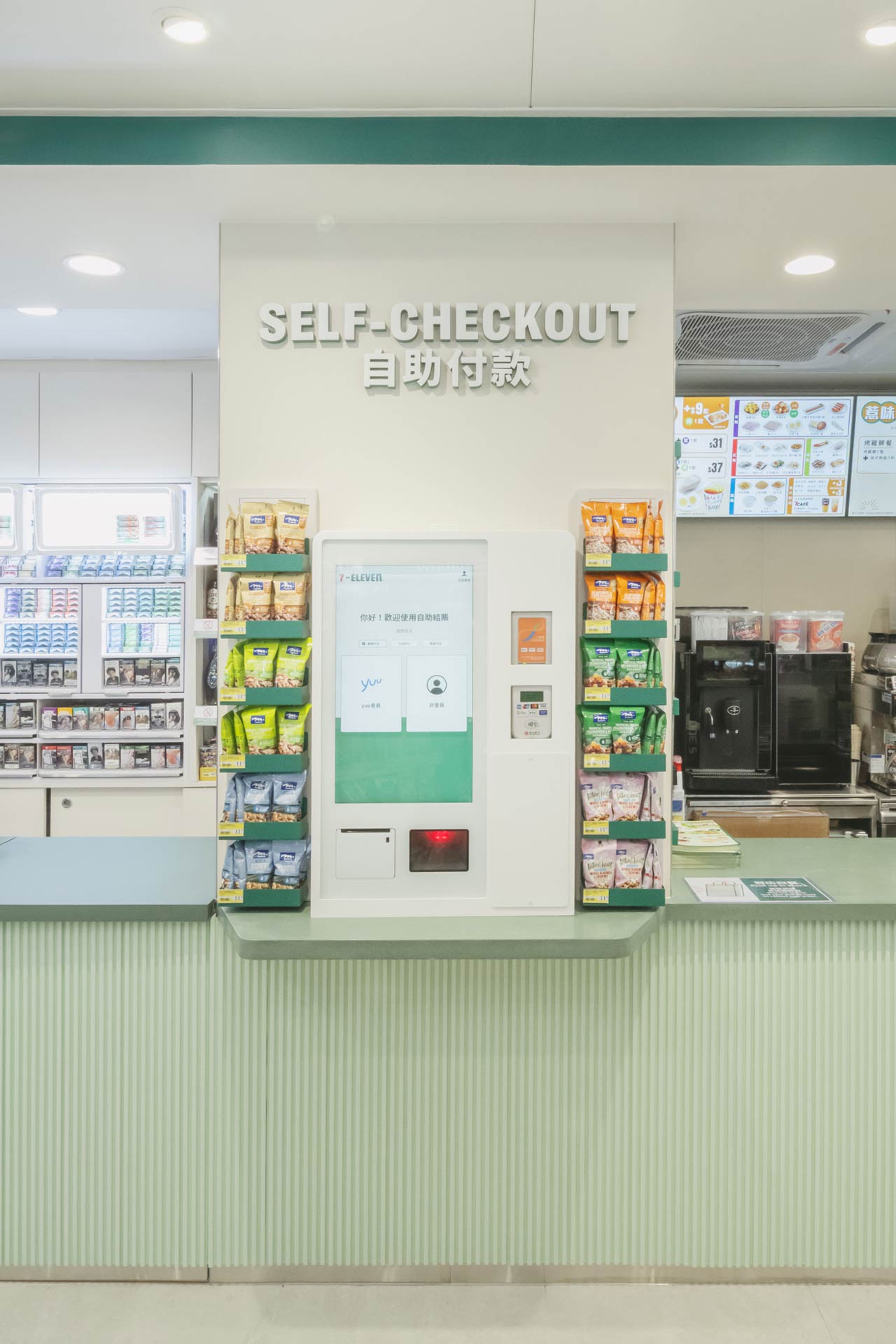
A new smart film (from FilmPlayers) at the shopfront displays real-time information, including time, weather forecasts, and promotional graphics for store products. Self-checkout counter was also seamlessly integrated into the overall design for improved check out experience. These innovative feature adds improves customer engagement and shopping experience.
Sustainable Design
We introduced the ChopValu community table, made from recycled chopsticks, to promote sustainability and provide a unique gathering space for customers to connect and enjoy their food.
Modern Lighting Design
The revamped lighting design features improved color temperature and L-shaped light fixtures that echo the iconic “7,” creating a visually striking element that enhances the store’s ambiance.
A Sense of Community
By re-designing the food area and community-centric spaces, we aim to create a hub where customers can gather and enjoy a quick bite amid the busy hustle and bustle of the Hong Kong city life.
Refreshing Brand Colors
We revisited the brand’s color palette, transitioning from traditional white and orange to a vibrant green. This new scheme symbolizes growth, sustainability, and a commitment to a healthier lifestyle.
Fun and Foodie Elements
By redesigning the food counter presentation of gourmet food, we celebrate the joy of food and make the shopping experience refreshing.